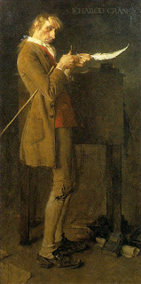
This is a tin that my birth Mum gave to me long ago. It's been the place that I keep many of my miniature things, like a small coin & stamp collection, little plastic toys and random bits of my life, past and present.. It was the first Rockwell I'd ever seen.. It was also the first painted illustration, where in that magical pre-digital moment, begged my young mind to determine whether it'was a photograph or not as well.. It remains on my desk as encouragement to strive for my next level of skill.. Last month, on encouragement from Vinod & Emily, Pam and I had the pleasure of viewing a Norman Rockwell exhibit in Tacoma,WA. Over forty original Rockwell paintings, Prints of the famous Freedom Posters, and every cover Rockwell did for the Saturday Evening Post. I'm so very glad we went the distance, as after seeing these masterworks, I can't rightly say that I'll experience anything quite like it again? I've talked to other ADs and Artists who've seen Rockwell originals, and we're all a bit overwhelmed by it, we all share in that common sense of observing something of Greatness..
In terms of Technique :: I simply can't cover it all? There were points at which Rockwell pushed my digital mind so far back into my unconscious, that I was actually able to recollect the reason why I got into this odd business of illustration. Scale was of course at the forefront of every experience, as they are enormous canvases. Even the tiny B&W newspaper ad I saw for a brake pad company was around 28in. wide, approximately the width of my full color cover work?? I remember

Donato Giancola saying at a convention how much painting larger changed his perception, and now I can see why.. The use of type painted right on the illustration has all but gone the way of the dinosaur, so to see experimentation, and serendipity within the same piece was amazing.. I'm convinced Rockwell's eyes saw nothing but light and color, and he painted so deliberately with that light, it made me jaw sink more than a couple times. (they didn't make me wear a drool cup, which was nice on the curators part.) I saw underpaintings that ranged from dark blues to what looked like diluted india ink red. Some paintings came up from a series of washes, where others were so caked on, wet-on-wet that it looked as though Rockwell was painting with a roller.. Through most of his metallic surfaces, you'd see his sketch, letting the slight graphite glare add to it's shine.
Although, more than anything else that stood out that day was Rockwell's use of textural relief.. There's really no describing this, and they wouldn't let me take pictures (even after I offered to wash their car) so let me say that this element gave each illustration a "museum" feel..?? In "Christmas Eve in Bethlehem" detailed above, there was canvas left just bare so that the head dress and army uniforms would feel more like cloth.. The rippling aura of the electric light is created with 1/4in. thick titanium white that's been carved with a pallet knife.. Makes it look like the light is actually shimmering.. It's not perceptible on any print or pic because of the scale, but in just about every painting, Rockwell backs up his surface with textural elements coinciding with the material at hand.. The bubbles that form around the finger tips of the boy and girl being dunked under water are about an 1/8 inch on top of the canvas.. In the famous painting of the wall in "The Problem We All Live With", that grout line has actual sand inclusions scraped into it, making the original canvas as stone like as actual stone..
In terms of Content :: Rockwell's humor is both as subtle and deliberate as is the case with his technique. With so many amazing portraits; simple, complex, expressionistic, anthropomorphic and stretched as far as they'd go before looking inhuman, it's hard to imagine the man ever being fooled by someone's intentions. I'm positive Rockwell was the kind of observer who'd of read your face within the first three seconds of meeting you.
Unlike the way I tend to direct attention quite blatantly with levels of detail when I'm composing a painting, Rockwell instead kept a similar level of detail (insane amounts) on everything around the focal point, not forcing your eye, but letting it come around to it eventually, and leaving the individual to find favored areas of the painting on their own.
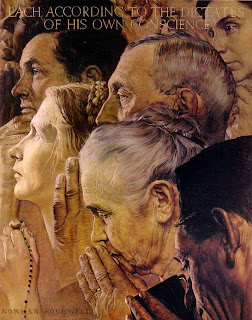
Although I'd always thought Rockwell and his photographers, were known for a certain squeaky clean portrayal of a sort of dreamed up, unachievable America. It turns out that he was more a realist and protesting old curmudgeon than I expected! The story of philosopher Will Durant, and Rockwell's
Four Freedoms paintings shows us that Rockwell even fought the Military establishments ideology, and in many ways taught us more about the philosophy of Peace, Tolerance and Unity, than simple reminiscence of youth, humor and patriotism... far more..
If you get a chance to visit the Rockwell Museum, or if the traveling show is in a nearby town, do yourself a favor and go experience these masterworks.. Stay Tuned !! =)
 This is a tin that my birth Mum gave to me long ago. It's been the place that I keep many of my miniature things, like a small coin & stamp collection, little plastic toys and random bits of my life, past and present.. It was the first Rockwell I'd ever seen.. It was also the first painted illustration, where in that magical pre-digital moment, begged my young mind to determine whether it'was a photograph or not as well.. It remains on my desk as encouragement to strive for my next level of skill.. Last month, on encouragement from Vinod & Emily, Pam and I had the pleasure of viewing a Norman Rockwell exhibit in Tacoma,WA. Over forty original Rockwell paintings, Prints of the famous Freedom Posters, and every cover Rockwell did for the Saturday Evening Post. I'm so very glad we went the distance, as after seeing these masterworks, I can't rightly say that I'll experience anything quite like it again? I've talked to other ADs and Artists who've seen Rockwell originals, and we're all a bit overwhelmed by it, we all share in that common sense of observing something of Greatness..